Search
Getting Started
Tools & topics
Design System
Components
Functions
Dependencies
Secrets
On this page
Editor
Explore the features of the component and page editor.
Explore the features of the component and page editor.
Explore the features of the component and page editor.
On this page
On this page
Labelled overview
Labelled overview
Labelled overview
The following details the features of the component and page editor.
The most common use cases for Symbols are:
Build UIkits / design systems: components, pages style guide, functions etc.
Building web applications: SaaS products, internal tools & integrations, customer portals, etc.
Building websites: landing pages, personal portfolios, blogs, marketing websites, online stores
These use cases are distinct, yet they share many similarities and overlapping requirements. Enhancements in one area often directly benefit others. Symbols leverages this commonality, providing a unified visual platform and a single source of truth for all.
Learn more about each use cases by following the above links.
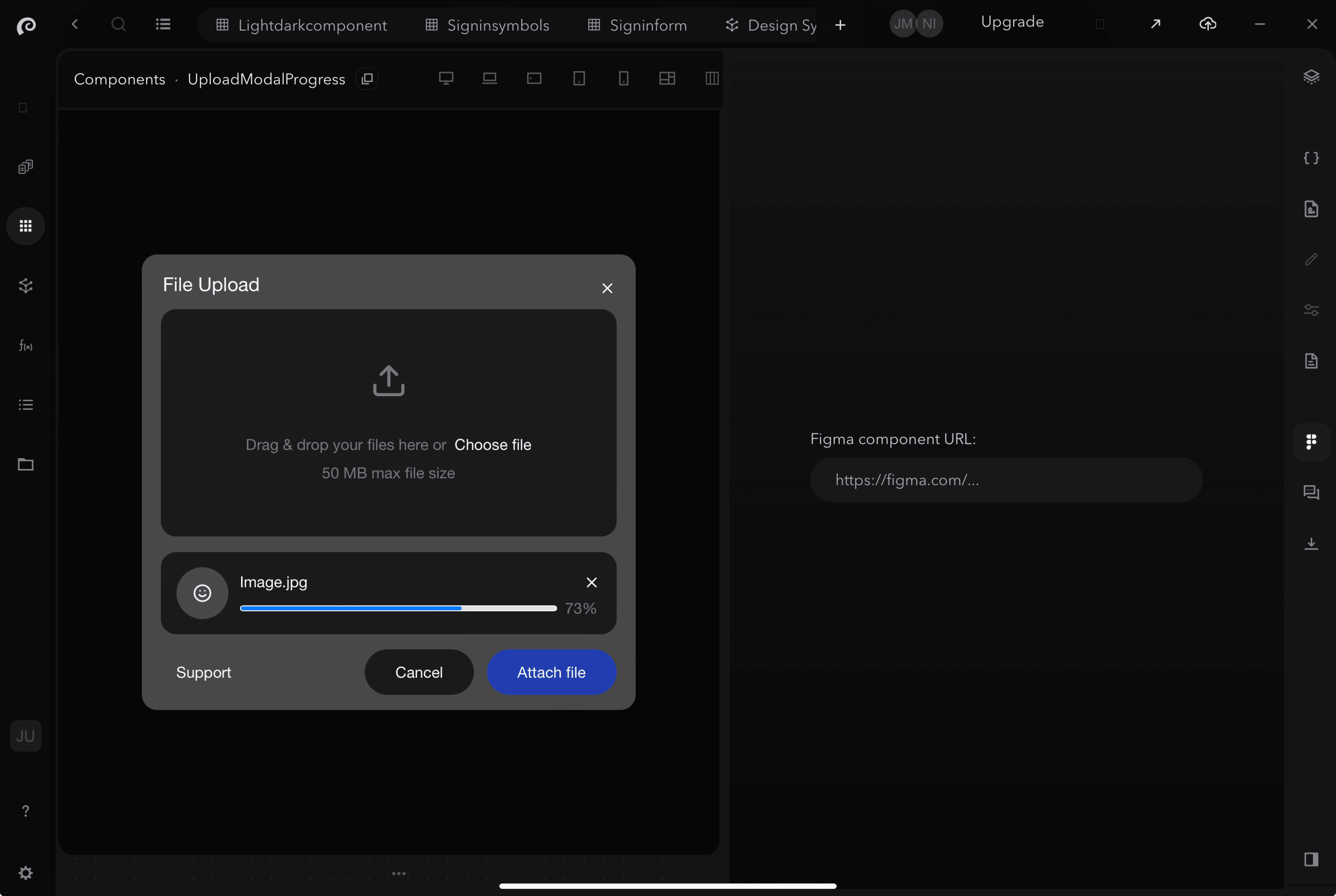
Top Bar
1. Breadcrumbs
Navigate back to previous sections of a compoent or page, by clicking on the link you wish to go back to.
2. Responsive and breakpoint device sizes
View your component / page in different device sizes with options for set devices, all devices or responsive freedom.
3. Left to right accessibility
Test your component with left to right accessibility
4. Global Themes
View your component in different global themes such as light & dark modes.
5. Actions
View additonal options including duplicating component
6. Full screen mode
Open the component editor to full screen
7. Minimise or close tab
Minimise the component editor window or close tab completely
8. Pin tool bar
Stick the top tool bar in place
Side Bar
9. Layers
View the layers of the compoent/page, and click on one to edit.
10. Code editor
Open the code editor window and start making changes.
11. Content
View your component / page in different device sizes with options for set devices, all devices or responsive freedom.
12. No-code editor
View your component / page in different device sizes with options for set devices, all devices or responsive freedom.
13. Properties
This window shows the properties of the component/window.
14. Documentation
This is where you can use no-code tools to provide additonal documentation, include where and how a component is used.
15. Figma file preview
View the Figma design file of your component/page.
16. Discussions
Add comments and discuss the component/page with other project participants.
17. Export
Choose which framework and where you want to export/sync your component/page to.
18. Switch menu
Switch the slide menu to appear on the left side.
Bottom Bar
18. Zoom in/out or reset
Enlarge, descrease or make reset the sizing of how your component/page is presented.
The most common use cases for Symbols are:
Build UIkits / design systems: components, pages style guide, functions etc.
Building web applications: SaaS products, internal tools & integrations, customer portals, etc.
Building websites: landing pages, personal portfolios, blogs, marketing websites, online stores
These use cases are distinct, yet they share many similarities and overlapping requirements. Enhancements in one area often directly benefit others. Symbols leverages this commonality, providing a unified visual platform and a single source of truth for all.
Learn more about each use cases by following the above links.
Best practices
Best practices
Best practices
The following details the toggles available to viewing and filtering your components..
Use side window to reuse components
Save time going back and forth between components to copy the code to reuse in another component, and instead just copy the name of the component you want to reuse from the side window.
The most common use cases for Symbols are:
Build UIkits / design systems: components, pages style guide, functions etc.
Building web applications: SaaS products, internal tools & integrations, customer portals, etc.
Building websites: landing pages, personal portfolios, blogs, marketing websites, online stores
These use cases are distinct, yet they share many similarities and overlapping requirements. Enhancements in one area often directly benefit others. Symbols leverages this commonality, providing a unified visual platform and a single source of truth for all.
Learn more about each use cases by following the above links.
Use layers to open an element of a component
Instead of opening each element of a component in a new tab, click on its layer to open it. The breadcrumbs navigation bar will update, allowing you to click back to the previous window.
The most common use cases for Symbols are:
Build UIkits / design systems: components, pages style guide, functions etc.
Building web applications: SaaS products, internal tools & integrations, customer portals, etc.
Building websites: landing pages, personal portfolios, blogs, marketing websites, online stores
These use cases are distinct, yet they share many similarities and overlapping requirements. Enhancements in one area often directly benefit others. Symbols leverages this commonality, providing a unified visual platform and a single source of truth for all.
Learn more about each use cases by following the above links.
Looking at another component’s properties
(TBC)
Reload page or component to see changes (coming soon)
By either updating the component or clicking the reload button, you can reload the component to see what has changed when it appears for the first time. This is particulary useful for components/pages with animations.
Side menu & window
Glance at different parts of your project, including style guide information, components, documentation and more, without changing tabs.
The most common use cases for Symbols are:
Build UIkits / design systems: components, pages style guide, functions etc.
Building web applications: SaaS products, internal tools & integrations, customer portals, etc.
Building websites: landing pages, personal portfolios, blogs, marketing websites, online stores
These use cases are distinct, yet they share many similarities and overlapping requirements. Enhancements in one area often directly benefit others. Symbols leverages this commonality, providing a unified visual platform and a single source of truth for all.
Learn more about each use cases by following the above links.
Easily highlight and inspect elements of a component
Enter inspect mode by either clicking on X or press option + B or click on, and hover over the component to highlight the elements of the component. Click on the element to open it.
The most common use cases for Symbols are:
Build UIkits / design systems: components, pages style guide, functions etc.
Building web applications: SaaS products, internal tools & integrations, customer portals, etc.
Building websites: landing pages, personal portfolios, blogs, marketing websites, online stores
These use cases are distinct, yet they share many similarities and overlapping requirements. Enhancements in one area often directly benefit others. Symbols leverages this commonality, providing a unified visual platform and a single source of truth for all.
Learn more about each use cases by following the above links.
Build with Figma file preview
Enhance and streamline the design-to-code process by building your UI kit with its Figma design, boosting your ability to replicate it.
The most common use cases for Symbols are:
Build UIkits / design systems: components, pages style guide, functions etc.
Building web applications: SaaS products, internal tools & integrations, customer portals, etc.
Building websites: landing pages, personal portfolios, blogs, marketing websites, online stores
These use cases are distinct, yet they share many similarities and overlapping requirements. Enhancements in one area often directly benefit others. Symbols leverages this commonality, providing a unified visual platform and a single source of truth for all.
Learn more about each use cases by following the above links.
Related documentation
Related documentation
Related documentation
Your might also find the following articles useful.
The most common use cases for Symbols are:
Build UIkits / design systems: components, pages style guide, functions etc.
Building web applications: SaaS products, internal tools & integrations, customer portals, etc.
Building websites: landing pages, personal portfolios, blogs, marketing websites, online stores
These use cases are distinct, yet they share many similarities and overlapping requirements. Enhancements in one area often directly benefit others. Symbols leverages this commonality, providing a unified visual platform and a single source of truth for all.
Learn more about each use cases by following the above links.
If you have any questions or need assistance, please don't hesitate to contact our support team at support@symbols.app
If you have any questions or need assistance, please don't hesitate to contact our support team at support@symbols.app
If you have any questions or need assistance, please don't hesitate to contact our support team at support@symbols.app