Search
Getting Started
Tools & topics
Design System
Components
Functions
Dependencies
Secrets
On this page
Themes
Learn how to create & use colours with the design system page.
Learn how to create & use colours with the design system page.
Learn how to create & use colours with the design system page.
On this page
On this page
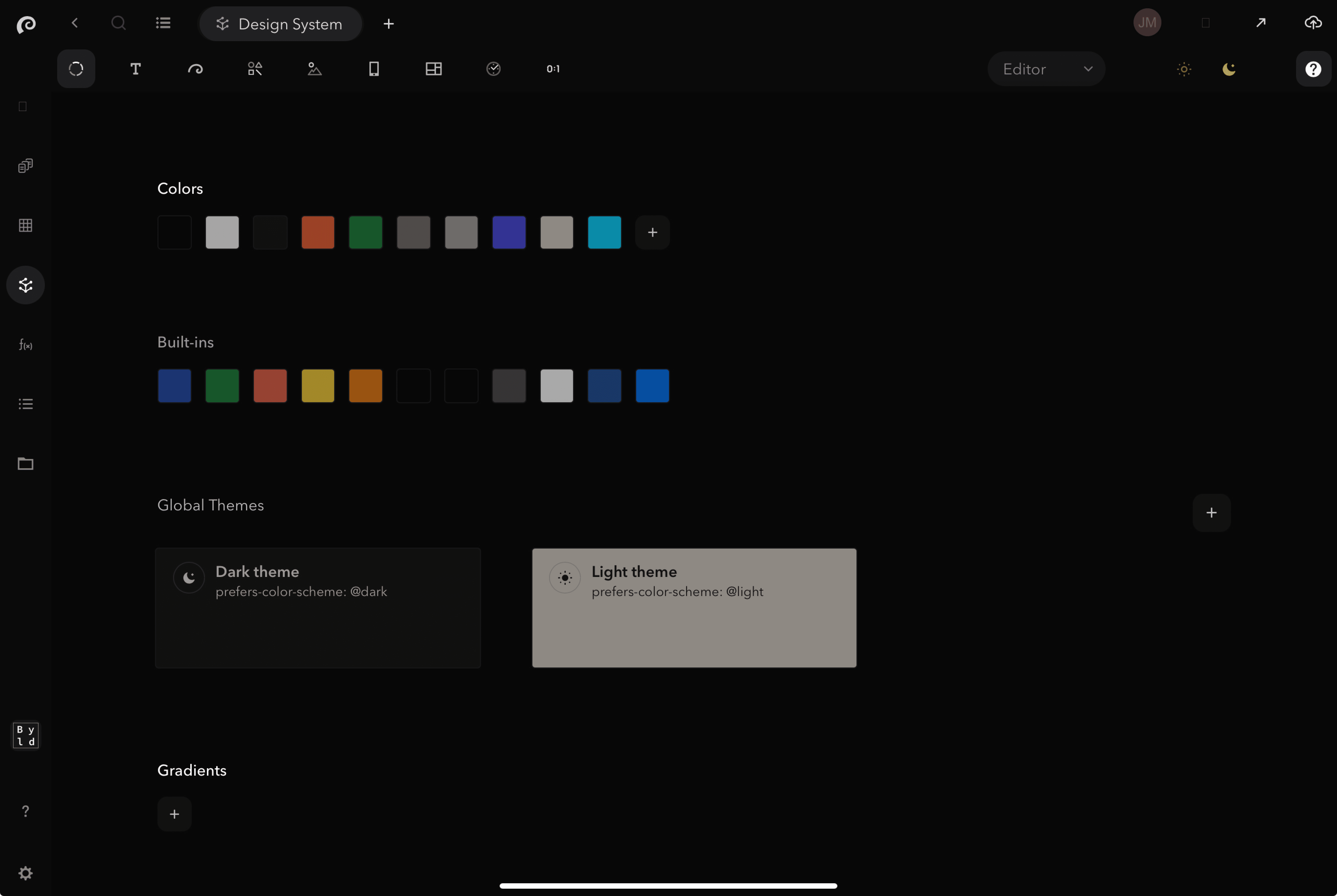
The themes within the design system page, groups many properties such as background colour, text colour, boarder colour and more, under a single class. Resulting in reduced code with easier reusability and scalability. Use it to both automate and reference theme related changes across your UIkit, to maintain branding consistency across your web project.
The most common use cases for Symbols are:
Build UIkits / design systems: components, pages style guide, functions etc.
Building web applications: SaaS products, internal tools & integrations, customer portals, etc.
Building websites: landing pages, personal portfolios, blogs, marketing websites, online stores
These use cases are distinct, yet they share many similarities and overlapping requirements. Enhancements in one area often directly benefit others. Symbols leverages this commonality, providing a unified visual platform and a single source of truth for all.
Learn more about each use cases by following the above links.

How to use themes
1) Click + to add Theme
2) Reference token name in your code
Add all the themes that you plan on using for your UIkit in the DS colours page, and reference the name of the token (theme) in your code as seen in the below examples.
Tip! Apply general changes to any component that references the same token
The most common use cases for Symbols are:
Build UIkits / design systems: components, pages style guide, functions etc.
Building web applications: SaaS products, internal tools & integrations, customer portals, etc.
Building websites: landing pages, personal portfolios, blogs, marketing websites, online stores
These use cases are distinct, yet they share many similarities and overlapping requirements. Enhancements in one area often directly benefit others. Symbols leverages this commonality, providing a unified visual platform and a single source of truth for all.
Learn more about each use cases by following the above links.

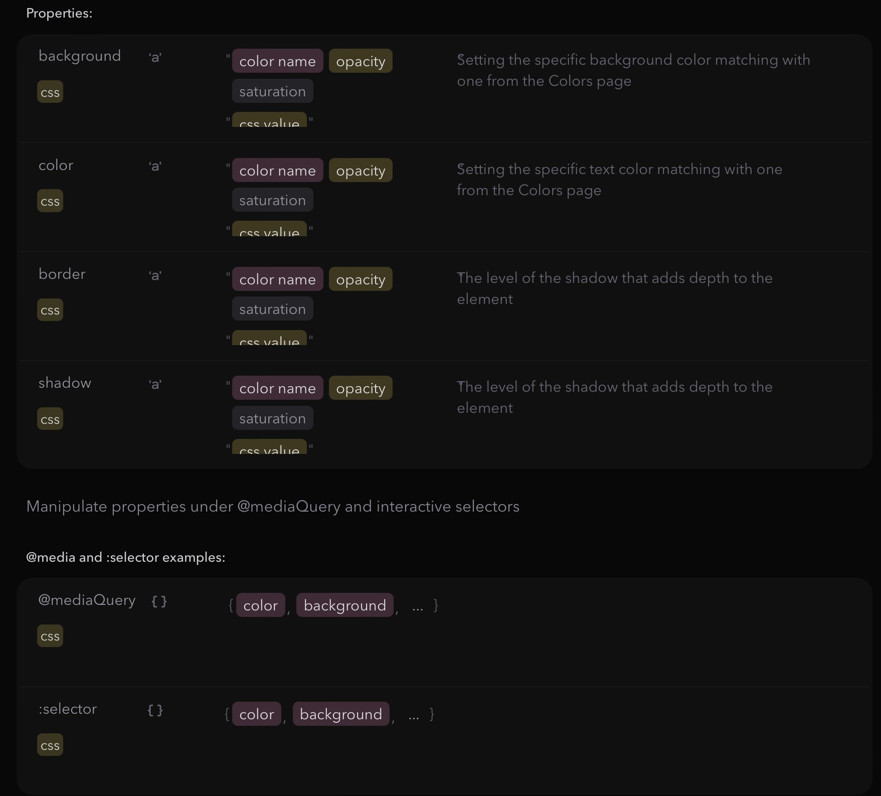
1Theming of the components and also the document itself. Each theme can be configured under media @dark and @light schemes.
The most common use cases for Symbols are:
Build UIkits / design systems: components, pages style guide, functions etc.
Building web applications: SaaS products, internal tools & integrations, customer portals, etc.
Building websites: landing pages, personal portfolios, blogs, marketing websites, online stores
These use cases are distinct, yet they share many similarities and overlapping requirements. Enhancements in one area often directly benefit others. Symbols leverages this commonality, providing a unified visual platform and a single source of truth for all.
Learn more about each use cases by following the above links.
Code example in design system:
Platform
The most common use cases for Symbols are:
Build UIkits / design systems: components, pages style guide, functions etc.
Building web applications: SaaS products, internal tools & integrations, customer portals, etc.
Building websites: landing pages, personal portfolios, blogs, marketing websites, online stores
These use cases are distinct, yet they share many similarities and overlapping requirements. Enhancements in one area often directly benefit others. Symbols leverages this commonality, providing a unified visual platform and a single source of truth for all.
Learn more about each use cases by following the above links.
{
  theme: {
    primary: {
      color: 'oceanblue',
      background: 'oceanblue 1 0.065',
      border: 'oceanblue 1 +0.1',

      '@dark': {
        color: 'white',
        background: 'oceanblue 0.1',
        border: 'oceanblue 0.1 +0.1'
      },

      ':hover': {
        background: 'oceanblue 1 +0.1'
Copy code
{
  theme: {
    primary: {
      color: 'oceanblue',
      background: 'oceanblue 1 0.065',
      border: 'oceanblue 1 +0.1',

      '@dark': {
        color: 'white',
        background: 'oceanblue 0.1',
        border: 'oceanblue 0.1 +0.1'
      },

      ':hover': {
        background: 'oceanblue 1 +0.1'
Copy code
{
  theme: {
    primary: {
      color: 'oceanblue',
      background: 'oceanblue 1 0.065',
      border: 'oceanblue 1 +0.1',

      '@dark': {
        color: 'white',
        background: 'oceanblue 0.1',
        border: 'oceanblue 0.1 +0.1'
      },

      ':hover': {
        background: 'oceanblue 1 +0.1'
Copy code
DOMQL via CLI
The most common use cases for Symbols are:
Build UIkits / design systems: components, pages style guide, functions etc.
Building web applications: SaaS products, internal tools & integrations, customer portals, etc.
Building websites: landing pages, personal portfolios, blogs, marketing websites, online stores
These use cases are distinct, yet they share many similarities and overlapping requirements. Enhancements in one area often directly benefit others. Symbols leverages this commonality, providing a unified visual platform and a single source of truth for all.
Learn more about each use cases by following the above links.
{
  theme: {
    primary: {
      color: 'oceanblue',
      background: 'oceanblue 1 0.065',
      border: 'oceanblue 1 +0.1',

      '@dark': {
        color: 'white',
        background: 'oceanblue 0.1',
        border: 'oceanblue 0.1 +0.1'
      },

      ':hover': {
        background: 'oceanblue 1 +0.1'
Copy code
{
  theme: {
    primary: {
      color: 'oceanblue',
      background: 'oceanblue 1 0.065',
      border: 'oceanblue 1 +0.1',

      '@dark': {
        color: 'white',
        background: 'oceanblue 0.1',
        border: 'oceanblue 0.1 +0.1'
      },

      ':hover': {
        background: 'oceanblue 1 +0.1'
Copy code
{
  theme: {
    primary: {
      color: 'oceanblue',
      background: 'oceanblue 1 0.065',
      border: 'oceanblue 1 +0.1',

      '@dark': {
        color: 'white',
        background: 'oceanblue 0.1',
        border: 'oceanblue 0.1 +0.1'
      },

      ':hover': {
        background: 'oceanblue 1 +0.1'
Copy code
Code example in component:
Platform
The most common use cases for Symbols are:
Build UIkits / design systems: components, pages style guide, functions etc.
Building web applications: SaaS products, internal tools & integrations, customer portals, etc.
Building websites: landing pages, personal portfolios, blogs, marketing websites, online stores
These use cases are distinct, yet they share many similarities and overlapping requirements. Enhancements in one area often directly benefit others. Symbols leverages this commonality, providing a unified visual platform and a single source of truth for all.
Learn more about each use cases by following the above links.
The most common use cases for Symbols are:
Build UIkits / design systems: components, pages style guide, functions etc.
Building web applications: SaaS products, internal tools & integrations, customer portals, etc.
Building websites: landing pages, personal portfolios, blogs, marketing websites, online stores
These use cases are distinct, yet they share many similarities and overlapping requirements. Enhancements in one area often directly benefit others. Symbols leverages this commonality, providing a unified visual platform and a single source of truth for all.
Learn more about each use cases by following the above links.
{
  Button: { theme: 'primary'
Copy code
{
  Button: { theme: 'primary'
Copy code
{
  Button: { theme: 'primary'
Copy code
DOMQL via CLI
The most common use cases for Symbols are:
Build UIkits / design systems: components, pages style guide, functions etc.
Building web applications: SaaS products, internal tools & integrations, customer portals, etc.
Building websites: landing pages, personal portfolios, blogs, marketing websites, online stores
These use cases are distinct, yet they share many similarities and overlapping requirements. Enhancements in one area often directly benefit others. Symbols leverages this commonality, providing a unified visual platform and a single source of truth for all.
Learn more about each use cases by following the above links.
The most common use cases for Symbols are:
Build UIkits / design systems: components, pages style guide, functions etc.
Building web applications: SaaS products, internal tools & integrations, customer portals, etc.
Building websites: landing pages, personal portfolios, blogs, marketing websites, online stores
These use cases are distinct, yet they share many similarities and overlapping requirements. Enhancements in one area often directly benefit others. Symbols leverages this commonality, providing a unified visual platform and a single source of truth for all.
Learn more about each use cases by following the above links.
{
  Button: { theme: 'primary'
Copy code
{
  Button: { theme: 'primary'
Copy code
{
  Button: { theme: 'primary'
Copy code

If you have any questions or need assistance, please don't hesitate to contact our support team at support@symbols.app
If you have any questions or need assistance, please don't hesitate to contact our support team at support@symbols.app
If you have any questions or need assistance, please don't hesitate to contact our support team at support@symbols.app