Search
Getting Started
Tools & topics
Design System
Components
Functions
Dependencies
Secrets
On this page
Platform: Create & use components
Learn how to create and use a component with best practices and interactive examples in the platform.
Learn how to create and use a component with best practices and interactive examples in the platform.
Learn how to create and use a component with best practices and interactive examples in the platform.
On this page
On this page
Overview tutorial on components
Or checkout our developer guide instead…
Or checkout our developer guide instead…
Or checkout our developer guide instead…
1. Create a component
1. Create a component
1. Create a component
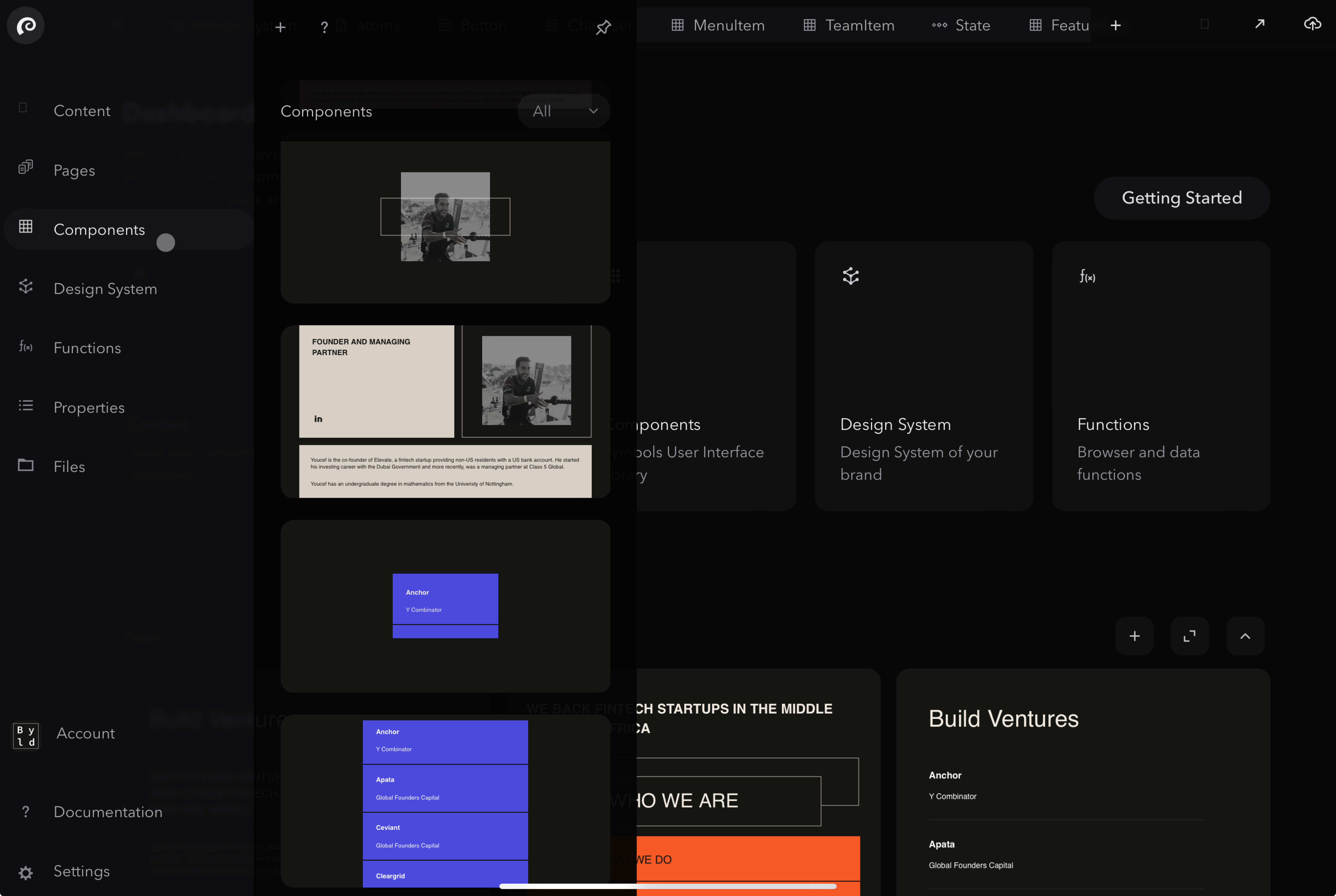
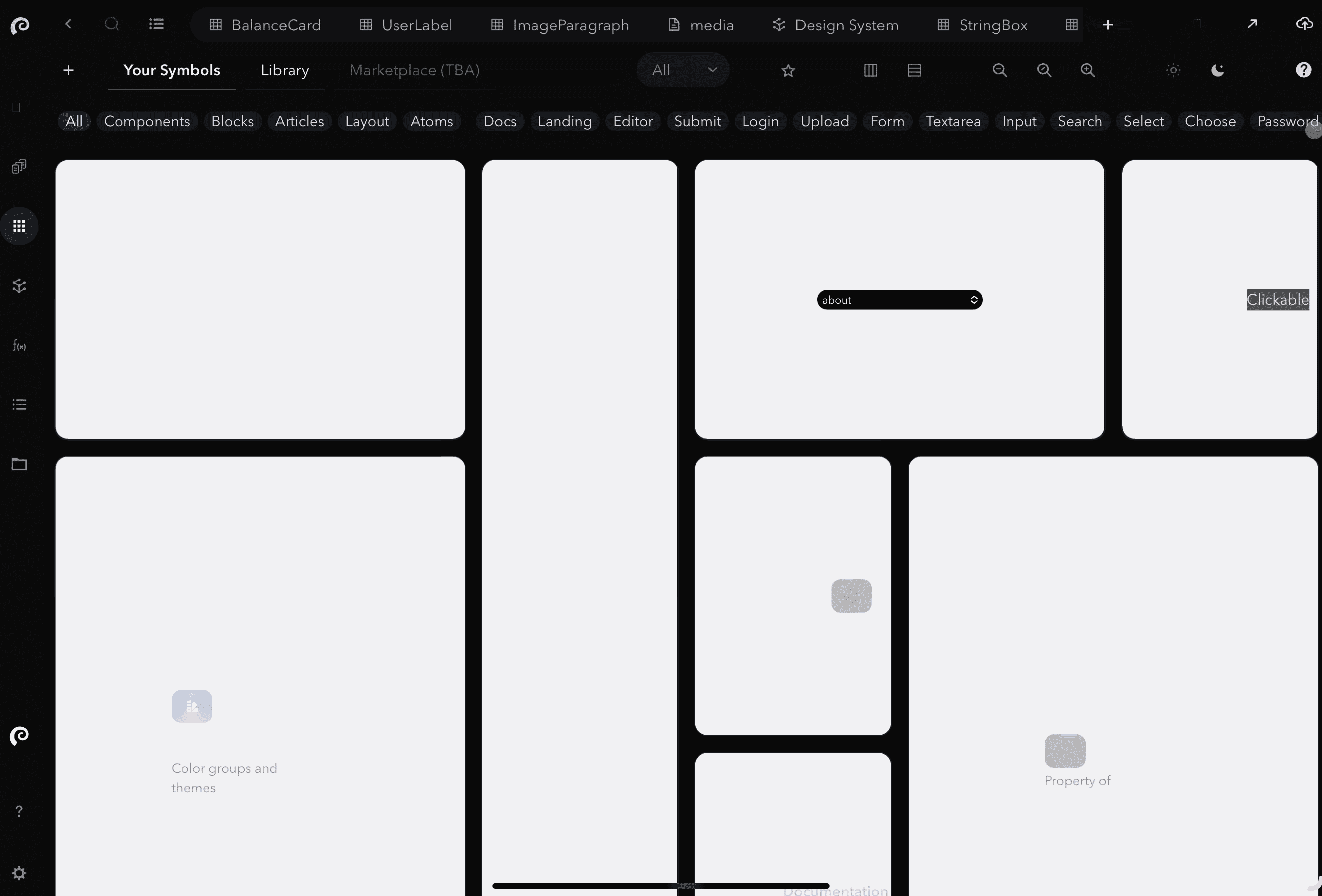
Click + to initiate adding a component, from the component library, side window or list menu.
The most common use cases for Symbols are:
Build UIkits / design systems: components, pages style guide, functions etc.
Building web applications: SaaS products, internal tools & integrations, customer portals, etc.
Building websites: landing pages, personal portfolios, blogs, marketing websites, online stores
These use cases are distinct, yet they share many similarities and overlapping requirements. Enhancements in one area often directly benefit others. Symbols leverages this commonality, providing a unified visual platform and a single source of truth for all.
Learn more about each use cases by following the above links.
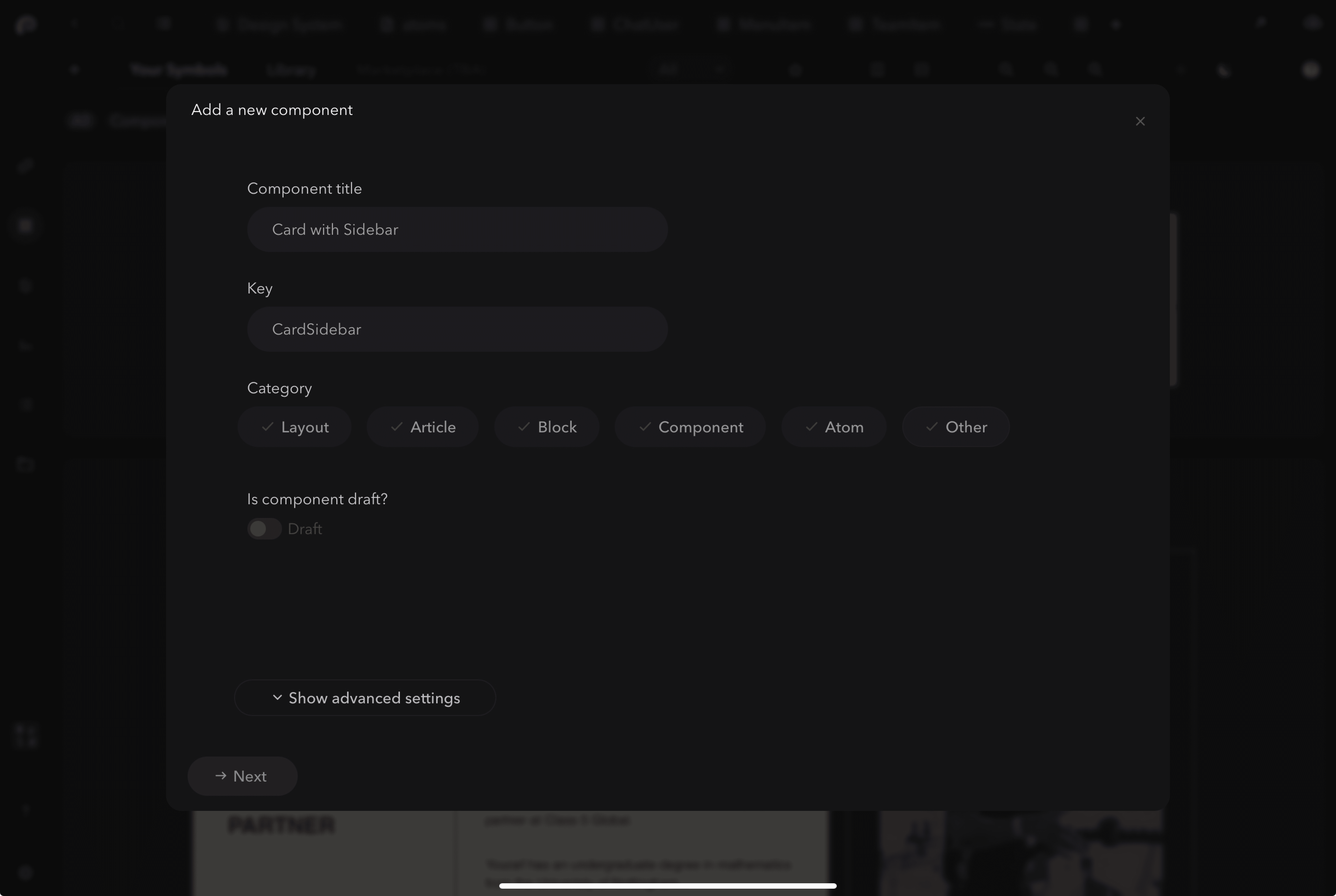
2. Enter details for new component and click “next”
The most common use cases for Symbols are:
Build UIkits / design systems: components, pages style guide, functions etc.
Building web applications: SaaS products, internal tools & integrations, customer portals, etc.
Building websites: landing pages, personal portfolios, blogs, marketing websites, online stores
These use cases are distinct, yet they share many similarities and overlapping requirements. Enhancements in one area often directly benefit others. Symbols leverages this commonality, providing a unified visual platform and a single source of truth for all.
Learn more about each use cases by following the above links.
Name: What you call the component
Category: The type of component (e.g Atom > small component)
Description: What the component is / does
Tags: What is this component associated with (e.g for landing?)
Tip: Enter all of the above details for better documentation and discoverability
The most common use cases for Symbols are:
Build UIkits / design systems: components, pages style guide, functions etc.
Building web applications: SaaS products, internal tools & integrations, customer portals, etc.
Building websites: landing pages, personal portfolios, blogs, marketing websites, online stores
These use cases are distinct, yet they share many similarities and overlapping requirements. Enhancements in one area often directly benefit others. Symbols leverages this commonality, providing a unified visual platform and a single source of truth for all.
Learn more about each use cases by following the above links.
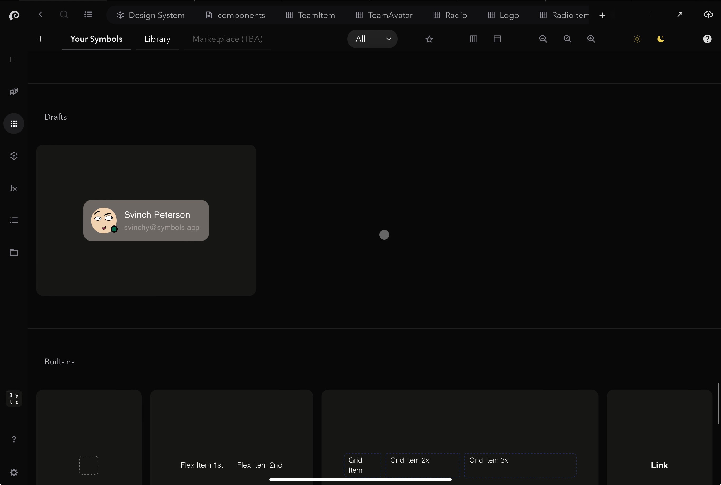
3. Component now added to library
The most common use cases for Symbols are:
Build UIkits / design systems: components, pages style guide, functions etc.
Building web applications: SaaS products, internal tools & integrations, customer portals, etc.
Building websites: landing pages, personal portfolios, blogs, marketing websites, online stores
These use cases are distinct, yet they share many similarities and overlapping requirements. Enhancements in one area often directly benefit others. Symbols leverages this commonality, providing a unified visual platform and a single source of truth for all.
Learn more about each use cases by following the above links.
Click on the component to open it
The most common use cases for Symbols are:
Build UIkits / design systems: components, pages style guide, functions etc.
Building web applications: SaaS products, internal tools & integrations, customer portals, etc.
Building websites: landing pages, personal portfolios, blogs, marketing websites, online stores
These use cases are distinct, yet they share many similarities and overlapping requirements. Enhancements in one area often directly benefit others. Symbols leverages this commonality, providing a unified visual platform and a single source of truth for all.
Learn more about each use cases by following the above links.
3. How to use component
3. How to use component
3. How to use component
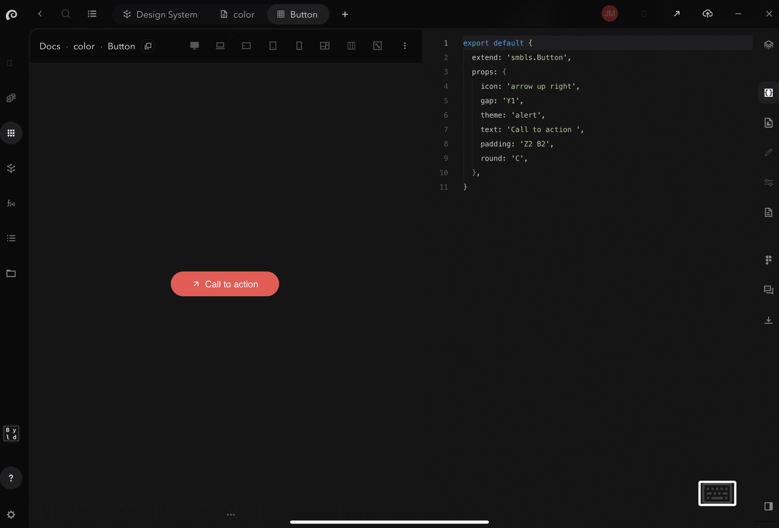
Start building your component
Click X to open the code editor window.
Tip! Apply general changes to any component that references the same token
The most common use cases for Symbols are:
Build UIkits / design systems: components, pages style guide, functions etc.
Building web applications: SaaS products, internal tools & integrations, customer portals, etc.
Building websites: landing pages, personal portfolios, blogs, marketing websites, online stores
These use cases are distinct, yet they share many similarities and overlapping requirements. Enhancements in one area often directly benefit others. Symbols leverages this commonality, providing a unified visual platform and a single source of truth for all.
Learn more about each use cases by following the above links.
Reuse the component by referencing the name in another component or page
The most common use cases for Symbols are:
Build UIkits / design systems: components, pages style guide, functions etc.
Building web applications: SaaS products, internal tools & integrations, customer portals, etc.
Building websites: landing pages, personal portfolios, blogs, marketing websites, online stores
These use cases are distinct, yet they share many similarities and overlapping requirements. Enhancements in one area often directly benefit others. Symbols leverages this commonality, providing a unified visual platform and a single source of truth for all.
Learn more about each use cases by following the above links.
4. Best practices
4. Best practices
4. Best practices
Get the most out of building and using components, with the following best practices.
The most common use cases for Symbols are:
Build UIkits / design systems: components, pages style guide, functions etc.
Building web applications: SaaS products, internal tools & integrations, customer portals, etc.
Building websites: landing pages, personal portfolios, blogs, marketing websites, online stores
These use cases are distinct, yet they share many similarities and overlapping requirements. Enhancements in one area often directly benefit others. Symbols leverages this commonality, providing a unified visual platform and a single source of truth for all.
Learn more about each use cases by following the above links.
Tagging
What is a tag?
Tags are descriptive labels assigned to components to categorize and identify them based on various attributes, e.g Atom, Landing, Button.
Why?
By implementing tags and the following practices, you can significantly enhance the component reusability and streamline the process of locating the correct component, within your development environment = Greater workflow efficiency to also avoid recreating a component that already exists.
1. Consistent Naming Conventions: Use clear and descriptive names that follow a consistent pattern, incorporating key attributes such as function, category, and context (e.g., `Button-Primary-Submit`, Call to action-buy now).
2. Hierarchical Tagging: Organize tags hierarchically to reflect the component's role and context within the project. For example, `UI/Buttons/Primary`.
3. Use Standardized Tags: Develop and adhere to a standardized set of tags for common attributes (e.g., `Primary`, `Secondary`, `Form`, `Navigation`) to ensure uniformity.
4. Regular Review and Cleanup: Periodically review and refine tags to maintain relevance and accuracy, removing outdated or redundant tags.
The most common use cases for Symbols are:
Build UIkits / design systems: components, pages style guide, functions etc.
Building web applications: SaaS products, internal tools & integrations, customer portals, etc.
Building websites: landing pages, personal portfolios, blogs, marketing websites, online stores
These use cases are distinct, yet they share many similarities and overlapping requirements. Enhancements in one area often directly benefit others. Symbols leverages this commonality, providing a unified visual platform and a single source of truth for all.
Learn more about each use cases by following the above links.
Adding a description
What is a component description?
A component description is a brief explanation that provides essential details about the component's function and usage.
Why?
To enhance component reusability and streamline the process of locating the correct component, adopt the following best practices for creating component descriptions.
1. Clear and Concise Language: Write descriptions that are easy to understand, avoiding technical jargon and keeping them succinct yet informative.
2. Highlight Key Attributes: Clearly state the component's primary function, purpose, and any unique characteristics (e.g., "A primary button used for form submissions").
3. Usage Context: Include information about where and how the component should be used within the project (e.g., "Ideal for use in form submission sections across the application").
4. Regular Updates: Periodically review and update descriptions to ensure they remain accurate and relevant as the project evolves.
The most common use cases for Symbols are:
Build UIkits / design systems: components, pages style guide, functions etc.
Building web applications: SaaS products, internal tools & integrations, customer portals, etc.
Building websites: landing pages, personal portfolios, blogs, marketing websites, online stores
These use cases are distinct, yet they share many similarities and overlapping requirements. Enhancements in one area often directly benefit others. Symbols leverages this commonality, providing a unified visual platform and a single source of truth for all.
Learn more about each use cases by following the above links.
Reusability
What is reusability?
Reusability is the practice of designing and using components in multiple applications or contexts without modification.
Why?
This is important because it increases development efficiency, reduces costs, ensures consistency across projects, and enhances maintainability. By reusing components, developers can avoid redundant work, quickly implement proven solutions, and focus on adding new features or solving unique problems, ultimately accelerating the development process and improving software quality.
Sure, here are some specific ways to reuse components in code:
The most common use cases for Symbols are:
Build UIkits / design systems: components, pages style guide, functions etc.
Building web applications: SaaS products, internal tools & integrations, customer portals, etc.
Building websites: landing pages, personal portfolios, blogs, marketing websites, online stores
These use cases are distinct, yet they share many similarities and overlapping requirements. Enhancements in one area often directly benefit others. Symbols leverages this commonality, providing a unified visual platform and a single source of truth for all.
Learn more about each use cases by following the above links.
If you have any questions or need assistance, please don't hesitate to contact our support team at support@symbols.app
If you have any questions or need assistance, please don't hesitate to contact our support team at support@symbols.app
If you have any questions or need assistance, please don't hesitate to contact our support team at support@symbols.app