Search
Getting Started
Tools & topics
Design System
Components
Functions
Dependencies
Secrets
On this page
General workflow with Symbols
The following outlines the general workflow from start to finish, including building and publishing UIkits and web projects in Symbols.
The following outlines the general workflow from start to finish, including building and publishing UIkits and web projects in Symbols.
The following outlines the general workflow from start to finish, including building and publishing UIkits and web projects in Symbols.
On this page
On this page
General workflow
General workflow
General workflow
Steps overview
Configure design system
Add components from Symbols library
Edit component(s) or build new ones
Build pages with components
Export or publish UIkit or web project
The most common use cases for Symbols are:
Build UIkits / design systems: components, pages style guide, functions etc.
Building web applications: SaaS products, internal tools & integrations, customer portals, etc.
Building websites: landing pages, personal portfolios, blogs, marketing websites, online stores
These use cases are distinct, yet they share many similarities and overlapping requirements. Enhancements in one area often directly benefit others. Symbols leverages this commonality, providing a unified visual platform and a single source of truth for all.
Learn more about each use cases by following the above links.
Can I skip some steps?
Yes! For example, you can start building components without setting up and using a design system. You can choose to set one up anytime.
The most common use cases for Symbols are:
Build UIkits / design systems: components, pages style guide, functions etc.
Building web applications: SaaS products, internal tools & integrations, customer portals, etc.
Building websites: landing pages, personal portfolios, blogs, marketing websites, online stores
These use cases are distinct, yet they share many similarities and overlapping requirements. Enhancements in one area often directly benefit others. Symbols leverages this commonality, providing a unified visual platform and a single source of truth for all.
Learn more about each use cases by following the above links.
1. Configure your project’s design system
1. Configure your project’s design system
1. Configure your project’s design system
In the design system, enter the colours, fonts, icons and more, that will be used in your project. This will allow you to store, fetch and automate branding across your UIkit.
The most common use cases for Symbols are:
Build UIkits / design systems: components, pages style guide, functions etc.
Building web applications: SaaS products, internal tools & integrations, customer portals, etc.
Building websites: landing pages, personal portfolios, blogs, marketing websites, online stores
These use cases are distinct, yet they share many similarities and overlapping requirements. Enhancements in one area often directly benefit others. Symbols leverages this commonality, providing a unified visual platform and a single source of truth for all.
Learn more about each use cases by following the above links.
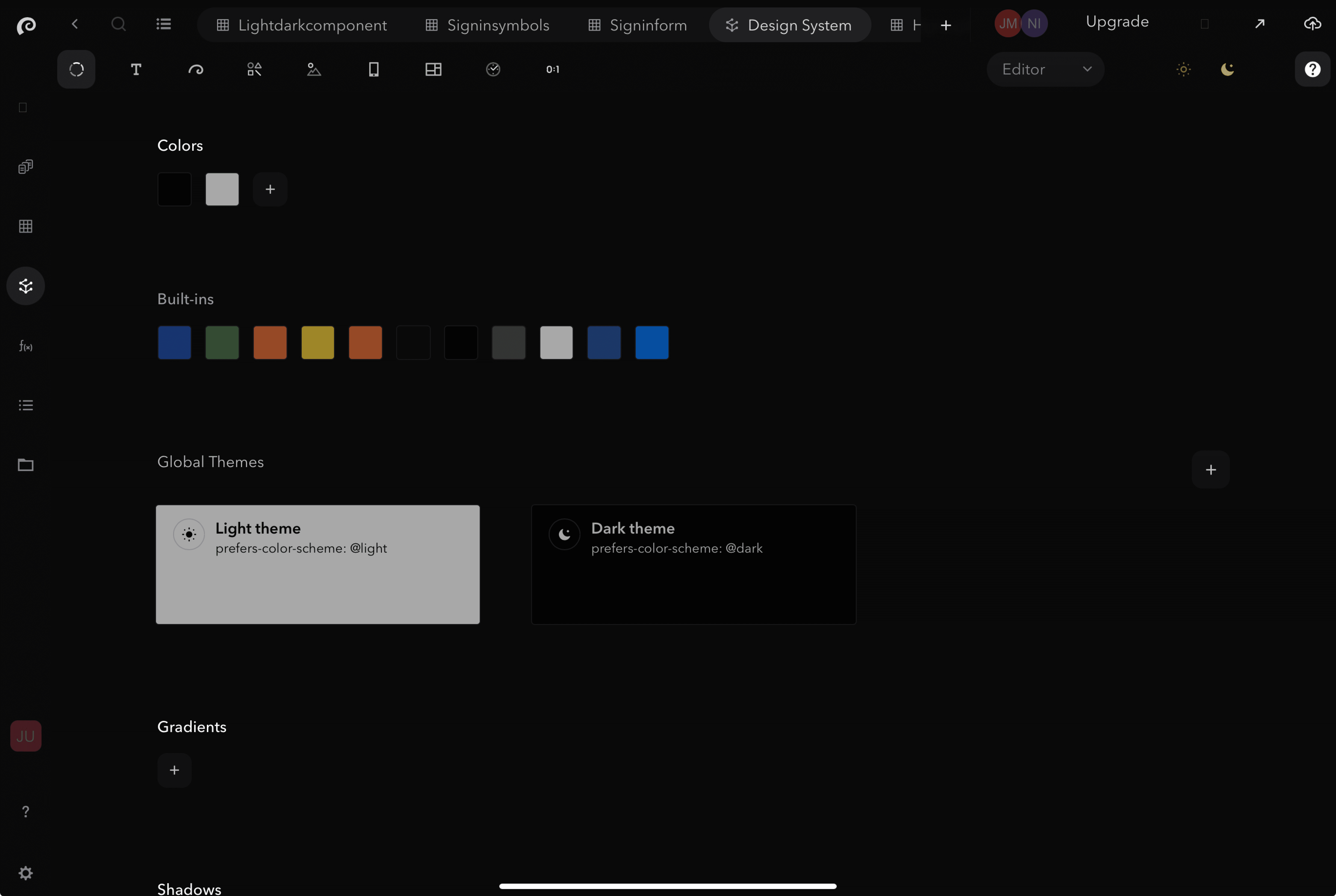
Starting from a design file?
If you are coming from a design file, such as from Figma or Sketch, copy the same tokens into the project’s design system.
Tip!
Copy the exact same naming conventions, hex colours etc, to streamline design to development.
The most common use cases for Symbols are:
Build UIkits / design systems: components, pages style guide, functions etc.
Building web applications: SaaS products, internal tools & integrations, customer portals, etc.
Building websites: landing pages, personal portfolios, blogs, marketing websites, online stores
These use cases are distinct, yet they share many similarities and overlapping requirements. Enhancements in one area often directly benefit others. Symbols leverages this commonality, providing a unified visual platform and a single source of truth for all.
Learn more about each use cases by following the above links.
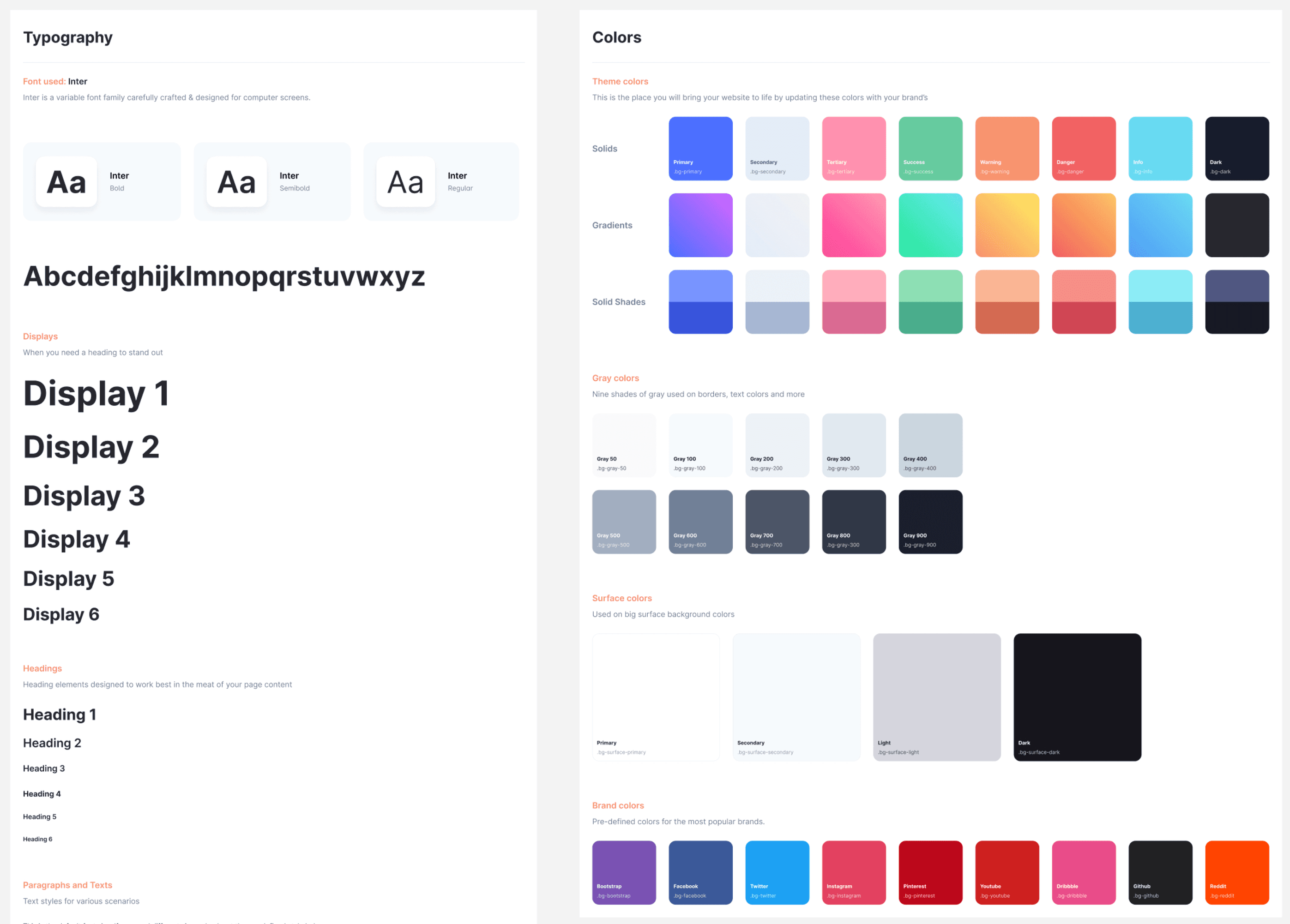

2. Review Symbols library
2. Review Symbols library
2. Review Symbols library
Review Symbols library for components that are suitable to use for your UIkit, and add those to “your Symbols” (project library).
The most common use cases for Symbols are:
Build UIkits / design systems: components, pages style guide, functions etc.
Building web applications: SaaS products, internal tools & integrations, customer portals, etc.
Building websites: landing pages, personal portfolios, blogs, marketing websites, online stores
These use cases are distinct, yet they share many similarities and overlapping requirements. Enhancements in one area often directly benefit others. Symbols leverages this commonality, providing a unified visual platform and a single source of truth for all.
Learn more about each use cases by following the above links.
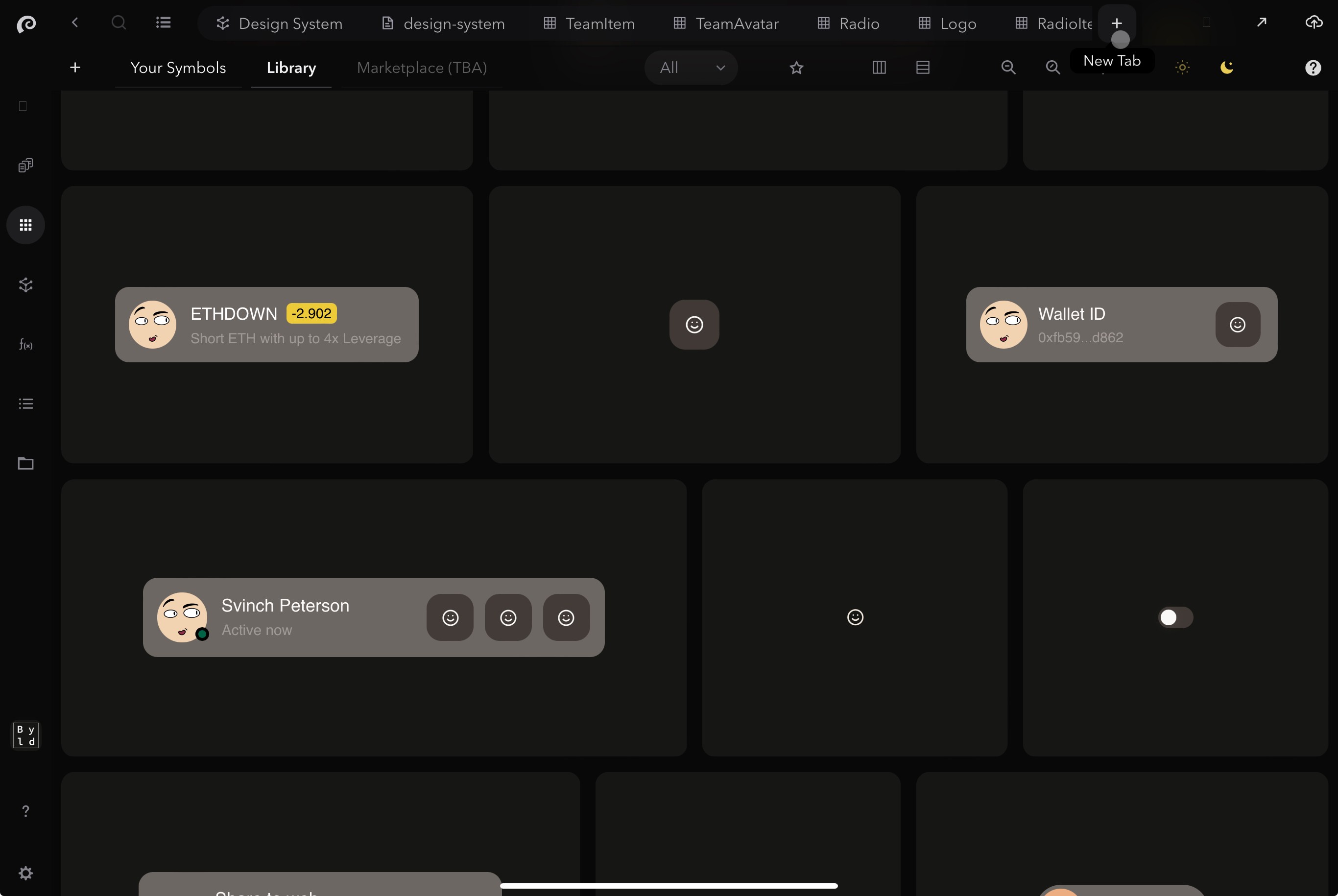


3. Edit and build new components
3. Edit and build new components
3. Edit and build new components
Edit the components that need some adjustments, and build the components that aren’t available in “your Symbols” (project library).
The most common use cases for Symbols are:
Build UIkits / design systems: components, pages style guide, functions etc.
Building web applications: SaaS products, internal tools & integrations, customer portals, etc.
Building websites: landing pages, personal portfolios, blogs, marketing websites, online stores
These use cases are distinct, yet they share many similarities and overlapping requirements. Enhancements in one area often directly benefit others. Symbols leverages this commonality, providing a unified visual platform and a single source of truth for all.
Learn more about each use cases by following the above links.
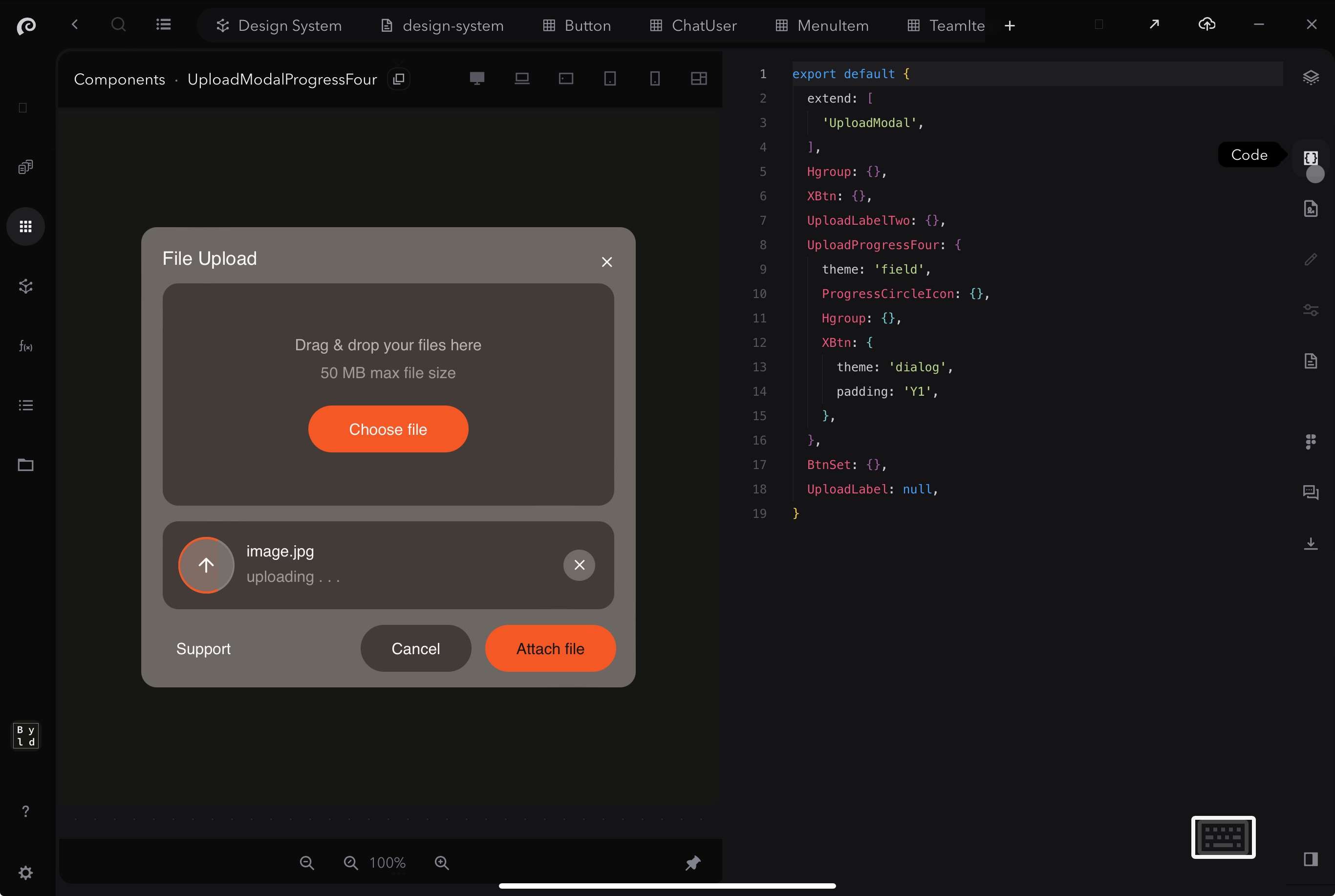


Add Figma preview per component (Optional but recommended)
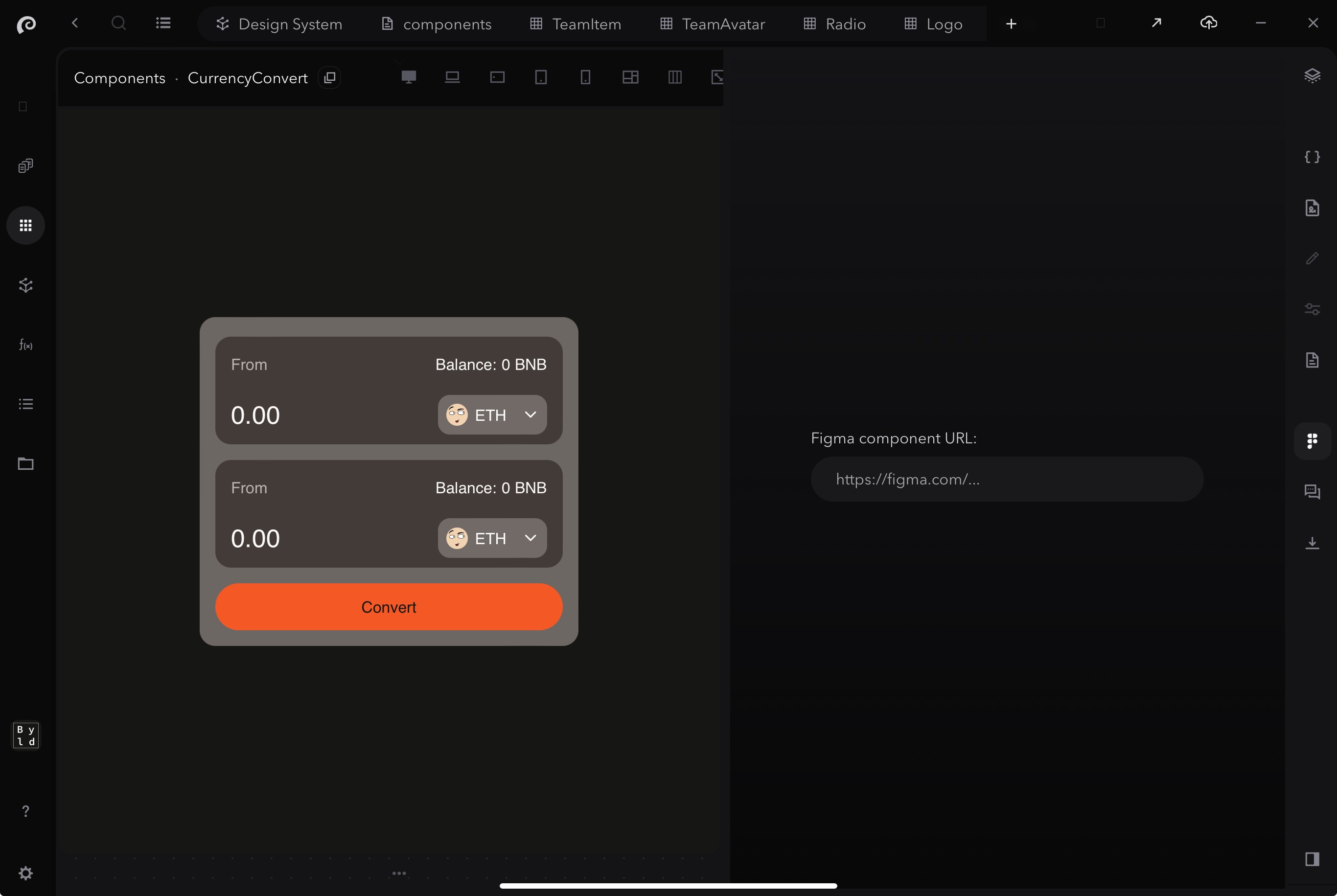
If you have components designed in Figma and plan on editing existing components or building new ones based on these designs, add a preview link in the editor for each component using the Figma toggle. This will allow you to see and compare the Figma design and the actual coded component side-by-side for each component you plan on making.
The most common use cases for Symbols are:
Build UIkits / design systems: components, pages style guide, functions etc.
Building web applications: SaaS products, internal tools & integrations, customer portals, etc.
Building websites: landing pages, personal portfolios, blogs, marketing websites, online stores
These use cases are distinct, yet they share many similarities and overlapping requirements. Enhancements in one area often directly benefit others. Symbols leverages this commonality, providing a unified visual platform and a single source of truth for all.
Learn more about each use cases by following the above links.


Test your components
If you have components designed in Figma and plan on editing existing components or building new ones based on these designs, add a preview link in the editor for each component using the Figma toggle. This will allow you to see and compare the Figma design and the actual coded component side-by-side for each component you plan on making.
The most common use cases for Symbols are:
Build UIkits / design systems: components, pages style guide, functions etc.
Building web applications: SaaS products, internal tools & integrations, customer portals, etc.
Building websites: landing pages, personal portfolios, blogs, marketing websites, online stores
These use cases are distinct, yet they share many similarities and overlapping requirements. Enhancements in one area often directly benefit others. Symbols leverages this commonality, providing a unified visual platform and a single source of truth for all.
Learn more about each use cases by following the above links.
The most common use cases for Symbols are:
Build UIkits / design systems: components, pages style guide, functions etc.
Building web applications: SaaS products, internal tools & integrations, customer portals, etc.
Building websites: landing pages, personal portfolios, blogs, marketing websites, online stores
These use cases are distinct, yet they share many similarities and overlapping requirements. Enhancements in one area often directly benefit others. Symbols leverages this commonality, providing a unified visual platform and a single source of truth for all.
Learn more about each use cases by following the above links.


Document your components
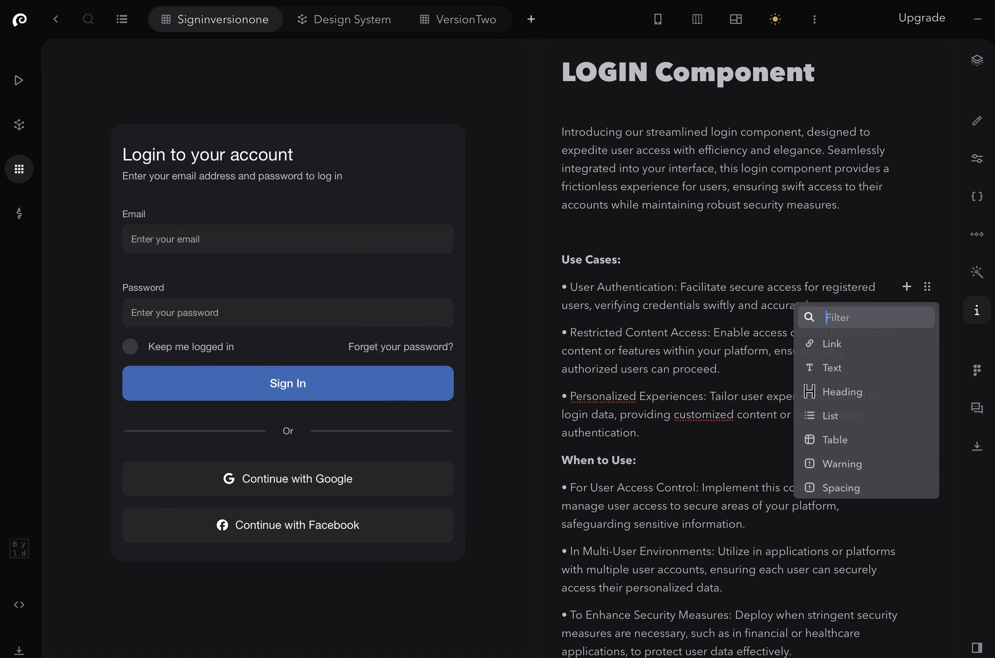
If you have components designed in Figma and plan on editing existing components or building new ones based on these designs, add a preview link in the editor for each component using the Figma toggle.
The most common use cases for Symbols are:
Build UIkits / design systems: components, pages style guide, functions etc.
Building web applications: SaaS products, internal tools & integrations, customer portals, etc.
Building websites: landing pages, personal portfolios, blogs, marketing websites, online stores
These use cases are distinct, yet they share many similarities and overlapping requirements. Enhancements in one area often directly benefit others. Symbols leverages this commonality, providing a unified visual platform and a single source of truth for all.
Learn more about each use cases by following the above links.


4. Start building your pages with “your Symbols” components.
4. Start building your pages with “your Symbols” components.
4. Start building your pages with “your Symbols” components.



Add Figma preview per page (Optional but recommended)
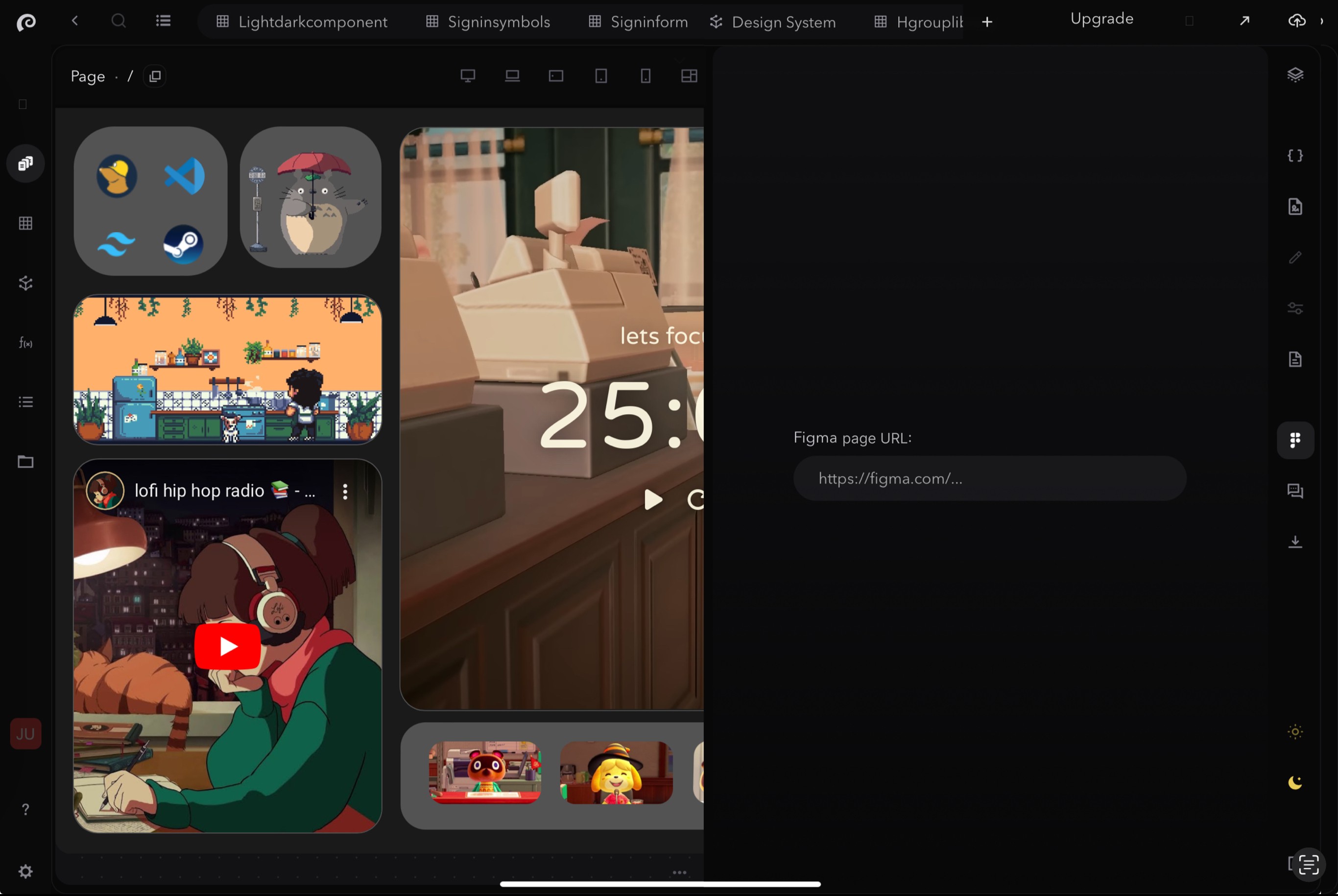
If you have pages designed in Figma and plan on editing existing pages or building new ones based on these designs, add a preview link in the editor for each component using the Figma toggle. This will allow you to see and compare the Figma design and the actual coded page side-by-side for each page you plan on making.
The most common use cases for Symbols are:
Build UIkits / design systems: components, pages style guide, functions etc.
Building web applications: SaaS products, internal tools & integrations, customer portals, etc.
Building websites: landing pages, personal portfolios, blogs, marketing websites, online stores
These use cases are distinct, yet they share many similarities and overlapping requirements. Enhancements in one area often directly benefit others. Symbols leverages this commonality, providing a unified visual platform and a single source of truth for all.
Learn more about each use cases by following the above links.


Test in dev mode
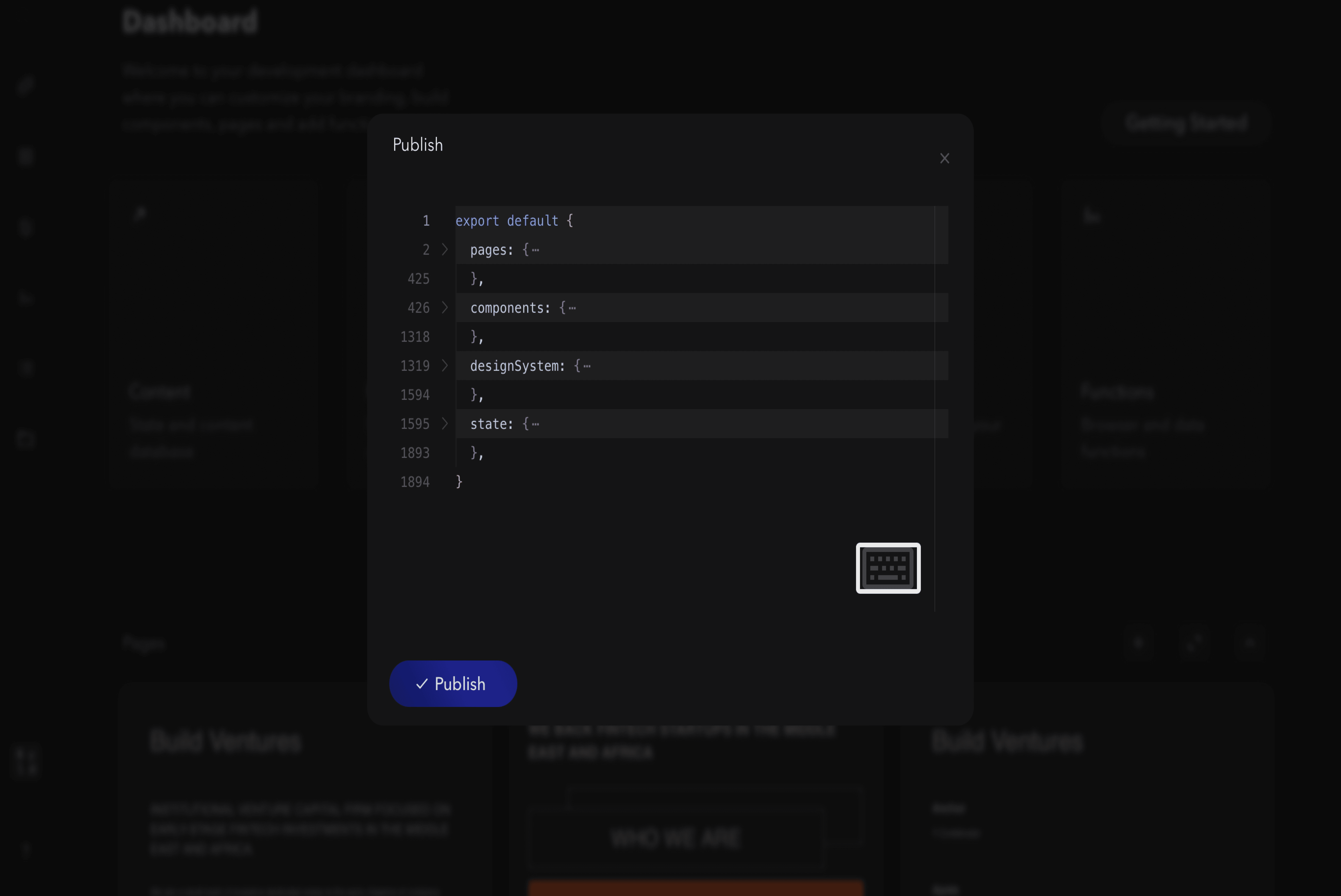
Leanr how to access and experiment with changes using the dev version of your web project, before you publish changes to the production version.
The most common use cases for Symbols are:
Build UIkits / design systems: components, pages style guide, functions etc.
Building web applications: SaaS products, internal tools & integrations, customer portals, etc.
Building websites: landing pages, personal portfolios, blogs, marketing websites, online stores
These use cases are distinct, yet they share many similarities and overlapping requirements. Enhancements in one area often directly benefit others. Symbols leverages this commonality, providing a unified visual platform and a single source of truth for all.
Learn more about each use cases by following the above links.


5. Export your UIkit or publish web project to production
5. Export your UIkit or publish web project to production
5. Export your UIkit or publish web project to production


If you have any questions or need assistance, please don't hesitate to contact our support team at support@symbols.app
If you have any questions or need assistance, please don't hesitate to contact our support team at support@symbols.app
If you have any questions or need assistance, please don't hesitate to contact our support team at support@symbols.app